
Table of Contents
Core Elements of a High-Converting Lead Magnet Landing Page
4 Proven Lead Magnet Landing Page Archetypes (With B2B Use Cases)
15 Lead Magnet Types That Belong on Dedicated Landing Pages
Design & Copy Principles That Move the Needle
Traffic, Targeting, and Message-Match (Why Your Best Page Still Might Not Convert)
Key Metrics and Benchmarks for Lead Magnet Landing Pages
From Page to Pipeline: Building the Post-Opt-In Journey
Frequently Asked Questions About Lead Magnet Landing Pages
A lead magnet landing page is a standalone web page built for one purpose: to exchange a high-value digital asset—an ebook, webinar replay, ROI calculator, audit, or similar resource—for a visitor’s contact details. Unlike your homepage or blog posts, this page has zero navigation menus, zero secondary CTAs, and zero distractions. It exists to capture leads and nothing else.
For B2B companies, this page represents the first “micro-yes” in your revenue funnel. It transforms cold or problem-aware traffic into marketing qualified leads that feed your SDR workflows and nurture sequences. Lead magnets are essential for building email lists and nurturing potential customers through the sales funnel, as they provide a valuable exchange for contact information. When you get this right, you’re not just collecting emails—you’re building a pipeline of potential clients and growing your email list for marketing purposes.
Dedicated lead magnet landing pages consistently outperform generic website pages. They deliver leads at a cost per lead 30-50% lower than multi-purpose homepages. The key is alignment: your lead magnet should be tailored to appeal directly to a specific audience and problem for better engagement.
Lead capture landing pages are essential for generating leads because they provide a focused environment where visitors can exchange their contact information for valuable content or offers. Your page has one job: get the right visitors to opt in. No generic “Subscribe to our newsletter” requests. No competing links. Either they convert or they leave.
Core Elements of a High-Converting Lead Magnet Landing Page
Pages that consistently hit 40-50% opt-in rates share the same structural building blocks, regardless of industry. High-converting lead magnet landing pages require a minimalist design, a focused headline, and low-friction forms. Here are the important elements that separate high performers from the pages that bleed traffic.
| Promise-Driven Headline | Your headline needs to communicate a specific, outcome-focused benefit—not the format of the lead magnet. The visual representation of the lead magnet is crucial for effective landing pages. High-converting landing pages typically have a single, clear call-to-action and use specific numbers in their headlines, such as “7 Templates” instead of just “Templates.” |
| Supporting Subhead | Elaborate in 1-2 sentences. Reinforce the benefit while setting expectations for what they’ll receive. |
| Hero Image or Mockup | Include a mockup image of your ebook cover, dashboard screenshot, or checklist preview. Visuals process 60,000 times faster than text. Landing pages that convert well often include a visual representation of the deliverable. |
| 3-5 Benefit Bullets | Focus on specific, quantifiable outcomes. “Identify your top 3 funnel leaks in 5 minutes” beats “Learn about funnel optimization.” Use bullet points to make these scannable. |
| Simple Form | Keep form fields to 1-2 fields for top-of-funnel assets. Every additional field risks 10-30% conversion drops. Removing distractions from a lead magnet landing page helps keep visitors focused on the desired action. |
| Strong CTA Button | Your call to action button label should reflect the outcome, not just the action. Use action language pointing toward the button. Use a contrasting color that stands out from the rest of the page. |
| Trust Signals | Client logos in grayscale, 1-2 short customer testimonials with names and titles, or stats like “Downloaded by 2,137 Founders.” Using social proof, such as testimonials or the number of previous attendees, can significantly enhance the credibility of a landing page and improve conversion rates. |
| Friction-Free Footer | No main navigation. No links to other pages. Nothing that gives visitors an escape route. |
Design supports clarity: use 1-2 fonts, plenty of white space, strong color contrast around your lead capture form, and mobile-first responsiveness since 60%+ of B2B traffic is mobile. Targeted B2B lead magnet pages typically convert 25-45%, while minimalist designs with warm audiences can hit 50-60%+.
4 Proven Lead Magnet Landing Page Archetypes (With B2B Use Cases)
Most high-performing lead magnet pages fall into four practical archetypes: the Minimalist Squeeze, the Value-Stack, the Quiz/Assessment, and the Webinar Registration Page. Each archetype comes with real-world examples and magnet landing page examples for each, including layout guidance, copy angles, and the metrics that matter. The archetype you choose should match your buyer’s readiness—awareness, consideration, or decision stage.
The Minimalist Squeeze Page (For Fast, Focused Conversion)
The minimalist squeeze page is a short, above-the-fold-focused layout built around a single lead magnet and a single email field. Minimalist squeeze pages, which focus on a single clear call to action and minimal distractions, can achieve conversion rates of 30-60% when traffic is well-targeted.
Key elements:

- Bold headline naming the asset and outcome
- 3-5 benefit bullets (no paragraphs, minimal copy)
- Simple mockup of the deliverable (ebook cover, checklist sheet, dashboard screenshot)
- One-field opt in form (email only)
- Direct CTA like “Get the 2026 Playbook”
This archetype works best with warm or intent-driven traffic: retargeting visitors, webinar viewers, podcast listeners, or email subscribers already familiar with your brand.
B2B Example: A “Revenue Funnel Scorecard” simple checklist for SaaS founders, promising “See where your funnel leaks within 5 minutes.” The page has no navigation, one compelling image, and asks only for an email address.
Speed matters here. You can build and launch a minimalist squeeze page in under 60 minutes by repurposing existing content. This makes them ideal for testing lead magnet ideas quickly against different traffic sources before investing in more elaborate pages.
The Value-Stack Landing Page (When You Need to Out-Value Competitors)
The value-stack landing page positions one opt in as a bundle to increase perceived value. Instead of offering a single free ebook, you create a package: “GTM Toolkit: ICP Worksheet + 7 Cold Email Scripts + Discovery Call Checklist.”
Value-stack landing pages, which bundle multiple resources together, can increase the perceived value of the offer and reduce friction in the opt in process. In competitive categories where a single checklist feels thin, this archetype justifies a slightly longer form while delivering more.
Layout elements:
- Headline framing the bundle (“Get the 7-Asset Revenue Funnel Toolkit”)
- Visual tiles for each included resource (thumbnail + 1-2 line description)
- Social proof cluster (“2,137 founders have downloaded this toolkit”)
- Simple form with 2-3 fields
- Single CTA button
Sales Funnel Professor Example: “The 7-Asset Revenue Funnel Toolkit for B2B Startups” with clear descriptions for each asset: Funnel Audit Template, CAC Calculator, Lead Scoring Matrix, Discovery Call Script, Follow-Up Email Sequences, Pipeline Dashboard Template, and Quarterly Review Framework.
Here’s what most people miss: you don’t need to create seven new assets from scratch. Repurpose existing SOPs, slide decks, or templates. The perceived value comes from the bundle, not from net-new production. These pages convert 30-45% in competitive categories where standalone offers struggle.
The Quiz or Assessment Funnel Landing Page (Data-Rich, High-Intent Leads)
Quiz and assessment pages swap the classic “download” for an interactive diagnostic. Interactive lead magnets like quizzes generate curiosity and engagement, often converting better than passive content offers for agencies, consultants, and higher-ticket SaaS.
Quiz funnels, which engage users with interactive assessments, can significantly reduce opt in resistance by reframing the exchange as a service rather than a transaction. You’re not asking them to give you something; you’re offering to diagnose their problem.
Layout elements:
- Curiosity-driven question headline (“What’s Your Revenue Funnel Health Score for 2026?”)
- Brief explanation (2-3 lines)
- Estimated completion time (“3 minutes, 12 questions”)
- Bold “Start Assessment” button above the fold
- Sample questions below the fold to reduce anxiety
The strategic benefit goes beyond conversion rates. You collect segmentation data—industry, ACV band, primary channel, team size—and use it to personalize follow-up email sequences and SDR outreach. Well-designed assessments achieve 40-60% completion once started and drive 20-30% reply rates when sales follow-up references the person’s custom score.
B2B Example: A “Pipeline Health Score” assessment that segments leads as “Growth-Ready,” “Conversion Bottleneck,” or “Retention Risk”—each triggering different nurture content.
The Webinar Registration Page (Lead Magnet for Mid- to Bottom-Funnel)
Live or on-demand webinars function as high-value lead magnets for prospects closer to a buying decision. Webinars serve as effective lead magnets by offering valuable content in exchange for contact information, leveraging the urgency of live events to encourage sign-ups.
Webinar registration pages need these elements:
- Outcome-focused headline (“Cut CAC by 30% in 90 Days Without Adding New Channels”)
- Date/time with timezone clearly displayed
- 3-5 key takeaways (what they’ll learn)
- Speaker bio with headshot and 1-2 credibility lines
- Countdown or scarcity element (“Limited to 250 seats”)
- Registration form (3-4 fields acceptable here)
Your body copy should sell the transformation, not the agenda. Focus on specific pains—low demo-to-close rate, bloated CAC, high churn—and outcomes like pipeline lift, predictable revenue, and faster time-to-close.
Specific CTA example: “Walk away with a prioritized list of your top 3 funnel fixes, benchmarks for your industry, and a 90-day action plan.”
After the live event, reuse the same dedicated landing page as an on-demand asset. Swap the date block for “Instant Access Replay” and adjust the urgency messaging. These pages convert 25-40% for registrations.
15 Lead Magnet Types That Belong on Dedicated Landing Pages
Your landing page is the “wrapper”—the actual lead magnet can take many forms depending on your funnel stage and sales motion. Written resources like ebooks, guides, and templates are popular lead magnets because they offer in-depth information and can be easily created or repurposed from existing content.
Here are great lead magnets for B2B, mapped to the buyer journey (see also these proven lead magnet examples):
| Funnel Stage | Lead Magnet Types |
|---|---|
| Top-of-Funnel (Awareness) | Checklists, cheat sheets, quizzes, resource lists, quick-win email sprints |
| Middle-of-Funnel (Consideration) | Benchmark reports, implementation guides, on-demand webinars, ROI calculators, email courses |
| Bottom-Funnel (Decision) | Free trials, product demos, audits, strategy calls, templates (“Cold Email Sequences That Book Meetings”), ROI simulators (“LTV:CAC Simulator”) |
Effective lead magnets in B2B tie directly to business outcomes—pipeline, CAC, LTV, win rate—rather than vague “tips and tricks.” The more specific the promise, the higher the conversion and the better the lead quality.
High-Intent Lead Magnets (Closer to Revenue)
Bottom-funnel offers like demos, consultations, free trials, strategy calls, and audits deserve their own dedicated landing pages. These are “high-intent magnets” that qualify as well as convert.
Your page needs to answer:
- Who is this offer for?
- What specific outcome will they get?
- What is the process and time commitment?
- What have others gotten from this?
Specific example: A “30-Minute ARR Funnel Review” page clearly states what’s reviewed: ad performance, landing pages, nurture sequences, sales handoff process, and attribution setup. It specifies the commitment (30 minutes) and the outcome (a prioritized list of fixes with estimated revenue impact).
Form fields can be longer here—role, company size, current ARR, primary channel, biggest bottleneck. Visitors are already committed enough to invest time in the form.
The metrics shift for high-intent lead magnet pages. They often have lower visit-to-lead rates (10-25%) but much higher lead-to-opportunity and lead-to-customer conversion compared to top-of-funnel gated offers.
Design & Copy Principles That Move the Needle
Most B2B landing pages fail not because of traffic quality, but because design and copy create friction and confusion. Here’s what actually moves the needle and helps you maximize conversions.
Copy principles that convert:
- Message-match with the ad or email (same language, same promise)
- Specific numbers in headlines (“7 Templates,” “2026 Benchmark Report,” “30 Minutes”)
- Outcome-first bullet points (“Book 40% more demos” not “Learn about demo strategies”)
- Active CTA language that should focus on the benefit to the user, such as boosting sales
Design best practices:
- One primary CTA color that creates strong color contrast
- Clear visual hierarchy (headline → benefits → form)
- Mobile optimization (test on actual devices)
- Contrast around the opt in box
- No unnecessary navigation that pulls visitors away
- Directional cues that guide users toward the form
Adding customer testimonials and social proof near the form can boost conversions 20-30% without lengthening the page. A simple cluster of 2-3 grayscale logos and one short quote with a name and title adds credibility without overwhelming the layout.
Before/After Example:
- Before: “Free Guide to Marketing”
- After: “7 Leaks Killing Your $1M Funnel: Fix Them in 90 Days”
The second headline converts at nearly double the rate because it’s specific, outcome-focused, and creates urgency.
Form Strategy: Fields, Friction, and Lead Quality
Every additional field is a trade-off between lead volume and lead quality. The key is matching gate intensity to where your visitor sits in the funnel.
Default setups by funnel stage:
| Funnel Stage | Form Fields | Example Fields |
|---|---|---|
| Top-of-Funnel | 1-2 | Email, First Name (optional) |
| Mid-Funnel | 3-4 | Email, Name, Company, Role |
| Bottom-Funnel | 5-7 | Email, Name, Company, ARR, Role, Primary Channel, Bottleneck |
Progressive profiling works well: collect just the email first, then ask for role, company size, and priorities in follow-up emails or on later lead magnet pages.
Technical best practices:
- Enable autofill where possible
- Show clear error states immediately
- Make the CTA button label specific (“Get the Benchmark Report” instead of “Submit”)
On high-intent pages, include one qualification question like “What’s your #1 revenue bottleneck right now?” This data becomes gold for sales routing and personalized outreach.
Trust & Proof: Making Your Landing Page Believable
B2B buyers are skeptical. They’ve seen too many overpromising lead magnets that underdeliver. Your landing page needs proof elements that match the sophistication of your audience.
Proof types that resonate with B2B buyers:
- Customer logos (3-5 recognizable brands in grayscale)
- Short testimonials with specific outcomes (“37% more demos in 90 days”)
- Download or usage numbers (“2,137 founders have used this”)
- Media mentions or conference appearances
- Security badges if you’re asking for sensitive information
Placement strategy:
- One proof cluster near the hero
- One near the form (this is where doubt peaks)
- Longer testimonials further down for skeptical readers
The proof should closely match the promise. If your lead magnet is a CAC reduction playbook, use CAC and pipeline metrics in the proof—not generic “great content” praise.
At Sales Funnel Professor, we help clients extract proof from existing results and translate it into high-converting snippets. Often the best testimonials are buried in email threads or Slack messages from happy customers.
Traffic, Targeting, and Message-Match (Why Your Best Page Still Might Not Convert)
No landing page exists in a vacuum. Your traffic source and pre-click message determine whether the page has a fair chance to convert. The design and content of capture landing pages should align with the expectations set by the traffic source.
| Traffic Source | Key Alignment Need |
|---|---|
| Paid Search (Google) | Headline matches search intent exactly |
| Social Ads (LinkedIn) | Visual and copy mirror the ad creative |
| Organic Search | Page answers the query from the meta title |
| Partner Traffic | Context from partner content maintained |
| Owned Email List | Subject line promise fulfilled on page |
“Message-match” means your headline echoes the promise made in the ad or CTA. If your LinkedIn ad promises “2026 B2B Funnel Benchmarks for US SaaS,” the landing page H1 should contain that exact phrase—not a generic “Free Ebook” headline.
Concrete example: A Google Analytics report shows high bounce rate on a lead generation landing page. Investigation reveals the paid ads promise “CAC Benchmarks” but the page headline says “Marketing Guide.” The fix is simple: align the language.
Map your top 3 traffic sources to specific lead magnet pages. Avoid dumping everything into a single “Resources” gate.
Aligning Lead Magnets to Funnel Stage and Buyer Readiness
The magnet, page, and traffic source need to form a coherent signal chain:
| Awareness | Checklists, quick wins, quizzes—low commitment, high curiosity |
| Consideration | Industry benchmarks, toolkits, on-demand webinars—deeper investment |
| Decision | Demos, free trials, audits, ROI calculators—ready to evaluate solutions |
Consider separate capture landing pages for different personas (founders vs. marketing leaders) or deal sizes (SMB vs. mid-market). The messaging resonates differently.
Aligning magnet + page + stage tends to drive better downstream metrics: higher MQL-to-SQL conversion, shorter sales cycles, and lower CAC. One client increased lead-to-opportunity conversion from 12% to 23% in 90 days by matching funnel-stage offers instead of pushing demos on everyone.
Sales Funnel Professor builds these maps as part of full-funnel audits. It’s one of the fastest ways to increase conversions without touching your traffic budget.
Key Metrics and Benchmarks for Lead Magnet Landing Pages
Serious B2B teams treat lead magnet pages as performance assets, not one-time campaigns. That means tracking metrics that prove it with numbers.
Core metrics to track:
- Visit-to-lead conversion rate
- Cost per lead (for paid traffic)
- Lead-to-opportunity conversion
- Opportunity-to-customer conversion
- Payback period on acquisition costs
Realistic benchmark ranges:
- Top-of-funnel magnet pages: 25-45% with targeted traffic
- Quizzes and minimalist squeeze pages: 40-60%
- High-intent demo/consult pages: 10-25% but with much higher downstream close rates
50% of marketers report increased signups when implementing lead magnets in their strategies. The lift compounds when you track the full funnel.
Example mini-metric set: 500 visits → 200 leads (40% conversion) → 30 opportunities (15% of leads) → 6 customers (20% of opps)
Segment performance by traffic source (Google Ads vs LinkedIn vs organic), by persona, and by lead magnet type. Use Google Analytics and your marketing automation platform to build these views.
A/B Testing & Optimization Strategy
Once a page has enough traffic (500+ unique visitors), begin systematic testing. Test one variable at a time:
- Headline copy and specificity
- Form length (number of form fields)
- Hero imagery or mockup image
- Proof placement and CTA copy
Avoid testing everything at once. One major variable per test keeps learnings clean and actionable. Aim for at least a 10-15% relative lift in conversion rate before calling a variation a winner.
Sales Funnel Professor runs 30-60 day testing cycles for clients, iterating offers and on-page elements to steadily compound gains. A 10% lift this month plus another 10% next month creates real separation over a quarter.
From Page to Pipeline: Building the Post-Opt-In Journey
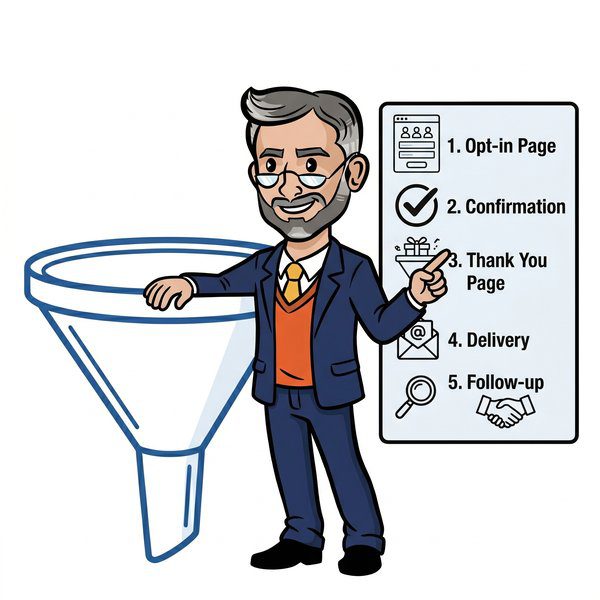
A lead magnet landing page is only step one. The follow-up sequence determines whether that lead ever turns into revenue. It’s important that a lead magnet is instantly delivered upon form submission for a high-quality user experience.
Key post-opt-in components:
- Immediate delivery email (instant, not 5 minutes later)
- Short nurture sequence tailored to the magnet
- Retargeting audiences built from page visitors (converts non-opters)
- Sales routing rules for high-intent form signals
Build a thank-you page that does more than say “check your inbox.” Use it to offer one next step—a related case study, a calendar link to book a call, or a second lower-friction offer for early-stage visitors.
For each lead magnet, create a dedicated nurture sequence tied to the specific magnet and use 3-6 emails over 7-21 days to move leads toward a deeper offer. Save time by templating these sequences.
Example 4-email sequence for a B2B lead magnet:
- Day 0: Delivery email with asset link and quick-win tip
- Day 2: “Here’s one thing to do today” actionable follow-up
- Day 5: Case study showing results from similar company
- Day 9: Invitation to book a strategy call or demo
Digital marketing works when these pieces connect. A new leads notification triggers sales outreach. A high engagement score surfaces potential customers for founder calls. The opt in starts a journey that ends in revenue.
Frequently Asked Questions About Lead Magnet Landing Pages
What is a lead magnet landing page, and how is it different from a homepage?
A lead magnet landing page is a standalone page built for one purpose: exchanging a high-value resource for a visitor’s contact details. Unlike a homepage, it has zero navigation, zero secondary CTAs, and zero distractions, so visitors either opt in or leave.
How many form fields should a lead magnet landing page have?
It depends on funnel stage. Top-of-funnel pages should stick to 1-2 fields since every additional field risks a 10-30% conversion drop. Mid-funnel pages can use 3-4 fields, and bottom-funnel, high-intent pages like demos and audits can justify 5-7 fields since visitors are already committed enough to invest the time.
What’s a good conversion rate for a B2B lead magnet landing page?
Realistic benchmarks vary by archetype: top-of-funnel magnet pages typically convert 25-45% with targeted traffic, quizzes and minimalist squeeze pages can hit 40-60%, and high-intent demo or consult pages usually land 10-25% but with much higher downstream close rates.
Which lead magnet landing page archetype should I start with?
Match the archetype to your traffic’s readiness. Minimalist squeeze pages work best for warm, intent-driven traffic like retargeting or webinar viewers. Value-stack pages help in competitive categories where a single offer feels thin. Quiz and assessment pages suit agencies and higher-ticket SaaS that want segmentation data. Webinar registration pages fit mid- to bottom-funnel prospects closer to a buying decision.
How soon after opt-in should I follow up with new leads?
Immediately. Deliver the lead magnet instantly, not minutes later, then follow with a short 3-6 email nurture sequence spread over 7-21 days that’s tailored to the specific magnet, moving leads toward a deeper offer like a case study or a call.
Do I need a separate landing page for every lead magnet?
Yes, for anything beyond a quick test. Dedicated pages let your headline, form length, and proof elements match the specific magnet and traffic source, which is what drives the 30-50% lower cost per lead that dedicated pages achieve over generic, multi-purpose pages.
How Sales Funnel Professor Can Help You Build High-Converting Lead Magnet Pages
If you’re a B2B founder, CMO, or revenue leader who doesn’t want to manage all this alone, here’s how we help.
Specific services:
- Funnel and landing page audits (identify what’s broken and prioritize fixes)
- Offer and lead magnet strategy (what to create, for whom, at what stage)
- Landing page copy and design
- Full nurture sequence and follow-up email builds
- CRM integration and automation setup
- Ongoing testing and conversion optimization
At Sales Funnel Professor, we’ve helped B2B teams lift lead magnet page conversion by 30-50% through focused copy, design, and sequence improvements. We work with founders and CMOs who want predictable pipeline from their inbound traffic—not just downloads.
If your lead magnet landing page isn’t converting at 25%+, or if your leads aren’t becoming demos, reach out to Sales Funnel Professor. We’ll diagnose the issue and build the fix.