CEO and founder of Esfera Design, Lawdeck, and Synthesi, collaborated with more than 200 companies and startups from San Francisco and around the world, helping them raise over $35 million in capital thanks to products that he and his team designed with UX/ UI and the forefront.
Nick sees AI as the future of everything and is investing in that direction.

Nick, you’ve built a global UX/UI powerhouse firm from your base in Curitiba, Brazil, serving clients in Silicon Valley as well as tech companies elsewhere.
We got the chance to collaborate with you on a PLG project that needed the same level of expertise that we often apply to conversion rate optimization applied to the post sign-up experience of a SaaS platform for artists and art collectors.
We’ll talk about what success means to you, how your work contributes to revenue, and get your thoughts on table stakes, MVP, and how great UX/UI contributes to adoption and revenue growth within the context of 2024 SaaS products.
Now let’s get to the good stuff…
Table of Contents
A Little Background
Defining UI
Defining UX
The Start of Esfera
MVP (minimum viable product)
Common Problems in Existing Saas Products
Thoughts on AI
A Little Background
Q: Before we talk about UX/UI itself, tell us a little bit about your early days… how did you get interested in that type of design in the first place?
A: Sure thing. I started working when I was 12. I come from a poor family, and my dad worked really hard to take care of us. He somehow managed to get us a computer during the early days of the internet—you know, when it was all dial-up and made those funny buzzing noises every time you tried to connect. My first gig was designing a label for a neighbor’s brewery using Corel Draw. That kicked everything off. Over the years, I did a lot of freelance work, and it seems like a natural step for graphic designers to move into UI/UX design. Around 2015, the product design world really started to take off, and my career just skyrocketed from there.
Q: How did you develop your skills to the point you felt like you were ready to apply them in a business environment?
A: I’ve always taught myself things, and learning English at 15 really opened up the business world to me. I got to know the US digital scene by watching YouTube, reading books, and doing freelance gigs. I’ve believed in learning by doing and taking chances, so I never waited until I felt fully ready to use my skills. Instead, I focused on working hard and constantly getting better. If my clients were happy, then I was happy. When they weren’t happy, then well..
Q: Can you remember some of your early work? What types of products were you working on?
A: Definitely! One of my first jobs was with a company that mixed sports, betting, and fantasy leagues. People could bet real money and earn points when their chosen teams scored in live games.
I also helped create a social media platform called Luep, which was like a mix of community spaces but without ads, which was really fun.
On top of that, I was a Senior Designer at a big UX firm in California, working with Fortune 500 companies and even the US Army. This experience really opened my eyes to how people think and interact with technology.
Early on, I learned that design isn’t just about making things look good. Every detail on a screen has to have a reason that taps into how users think, leading them smoothly towards what we want them to do or feel.
I spent the next five years diving into psychology to understand human behavior better. It’s easy to look at a design and judge it by its appearance, but there’s so much more to it. Companies like Apple and Airbnb are great examples of how understanding the user’s mind can really make a difference. And that’s what I aim to bring to my clients every day.
Defining UI
Q: Many people rarely talk about UI with UX in the same sentence. How would you define UI?
A: UI, or User Interface, is how people interact with a product, and while we often think of it as visual, like screens and buttons, it’s not just about seeing. For example, technology like screen readers and braille displays for those who can’t see are also types of UI, catering to touch and other senses.
Q: What are characteristics of mediocre, good and great UI?
A: Mediocre – It’s like those websites from the early 2000s to 2010s: everything’s a bit jumbled, there’s too much going on, and it’s hard to figure out what’s important.
Good – It looks nice and feels comfortable to use. There’s just the right amount of space, the colors are easy on the eyes, and everything’s where you expect it to be. The info is neatly laid out, making it simple to get what you need.
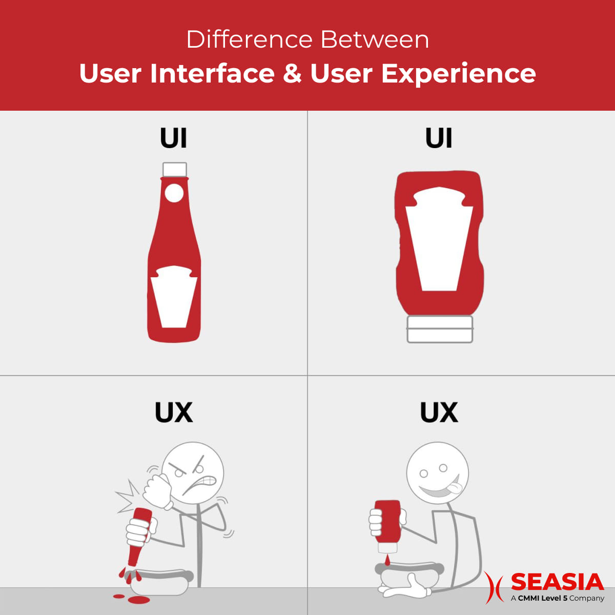
Great – It’s all the good stuff, plus it feels like it was made just for its audience. A top-notch UI really connects with the people using it, making the whole experience feel special. It runs smoothly on any device and doesn’t leave anyone out. And you know, I really love it when they throw in something new and creative.
Defining UX
Q: What about UX?
A: Think of the UI as the guitar in a band, and UX like the whole concert. UX is everything – it’s about understanding people, mixing a bit of psychology, math, writing, designing, sound, coding, and even business into one.
It helps us figure out who our audience is, what they need, and how to make something that’s just right for them.
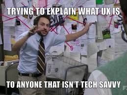
What should we put in our product? How do we put it together? Who’s going to use it? We’ve got to think about all these things before we even start designing the interface.
And it’s not just about the users, but also about the people making and selling the product. A top-notch UX takes everyone’s needs into account and brings out a product that just fits right in. It’s like enjoying a great song – when a product has a solid UX, using it just feels right.
Anyone can slap together a product using pre-made UI designs, but without a deep understanding of UX, that UI might as well be random. UX is what makes everything meaningful, creates a connection, and at the end of the day, convinces users to actually want and pay for the product.
Q: Same question, how do you tell the difference between mediocre, good and great UX?
A: Mediocre – It’s okay, but oh, so annoying. Ever try to click a button and nothing happens? And then the site won’t even tell you why it’s not working? You end up frustrated and just leave. It feels like you have to study just to use it, and you’re not even sure it’s what you need. Trying to find anything is a nightmare. Overall, it’s just a bad experience. It’s like trying to open a milk carton with a knife and ending up with a huge mess everywhere.
Good – It just makes sense. You don’t need a tutorial or anything; everything feels right where it should be. The design is clean and you feel like you can trust it. It’s like it knows exactly what you’re looking for and says, “Yep, I’ve got you covered.” If something goes wrong, it’s clear why and how you can fix it.
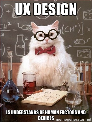
Great UX – It’s like your new favorite habit – you can’t get enough of it. It fixes all your problems, and you can’t imagine how you lived without it. Using it feels natural, almost as if it was made just for you. Every interaction feels rewarding, and just thinking about clicking a button gives you a dopamine high. It becomes a part of your daily life, making you wonder, how did it manage to do that? Think about the magic behind Uber, Instagram, TikTok, YouTube, Google, and the massive effect they’ve had on society. These are great products.
Q: From a standards perspective, what has changed and what has stayed the same about great UX and UI from those days?
A: The competition and the boom in smartphones and apps really changed what users expect from products.
Back in the day, just having an app that worked was impressive. But now, with so many apps out there fighting for attention, if your app’s design isn’t user-friendly, it doesn’t stand a chance.
A great user experience has become a must-have for people, and it’s something they’re not willing to compromise on. So, companies had to step up their game and start creating products that are not just good, but great, for their users.
As for what hasn’t changed, the desire for automation and the need for a product to serve a real purpose are still here. People still want to save time, connect with others, and have fun. These are basic human needs that aren’t going anywhere.
The Start of Esfera
Q: You founded your company, Esfera, back in 2020. What was the inspiration? What problems were you looking to solve?
A: After ten years of freelancing, I decided to try something new and joined a UX team in LA, California, just to see how it would go. It turned out to be a game-changer.

Working in a team made the design process so much more enriching. Brainstorming and sharing ideas with others really amped up the creativity.
When you’re on your own, it’s easy to get stuck in your ways, convinced your ideas are the best. But in a team, everyone shares their thoughts, pushing you to think differently and step out of your comfort zone. With that realization, going solo just didn’t make sense anymore, so I set out to create my own team of specialists, and that’s how Esfera was born.
Another plus of teamwork is it lets you zero in on what you’re really good at. Alone, you’re juggling everything from research to UI, UX, writing, and even the business stuff.
But on a team, you can focus on your strengths and really shine. Our clients absolutely love this approach, and it’s why we’ve kept most of them around for years.
MVP (Minimum Viable Product)
Q: You work with predominantly SaaS founders and the term MVP (minimum viable product) continues to be in heavy usage. What place does MVP have in developing a product that will eventually be monetized?
A: Creating and launching a product is a rollercoaster, filled with highs and lows, and every entrepreneur has faced the fear of failing at some point. This is where the concept of a Minimum Viable Product (MVP) comes into the picture. It’s like dipping your toes in the water before diving in.
By building an MVP, companies can introduce a basic version of their product to the market using minimal effort and lower costs. This allows users to test it out and give their feedback.

Professor’s Note
A Minimum Viable Product (MVP) is the most basic version of a product that contains only the essential features required to meet the needs of early adopters or customers. It serves as a prototype or initial version that allows a company to gather feedback and validate assumptions about the product’s viability in the market with minimal investment of time and resources.
If the MVP doesn’t meet the targets, no big deal—you haven’t spent too much, and you still have the energy and funds to tweak things or even take a new direction altogether.
This approach is much safer than going all out with a fully developed product only to find out it doesn’t resonate with your audience. In essence, an MVP is a smart move because it lets you understand the market and adjust your strategy without committing everything you have.
Q: As opposed to an MVP state, how would you describe “sales ready” in terms of UX/UI?
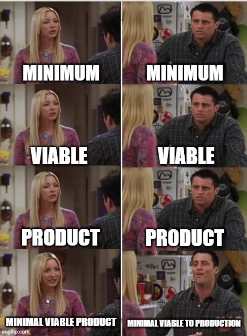
A: At Esfera, our Minimum Viable Product (MVP) standard is much higher than that and pretty much ready to sell, but that’s not how a lot of firms do it. Viable is determined by the user and just because a scooter is viable to get you to the grocery store in the rain doesn’t mean you won’t always choose a car.
An EPIC version of a product in terms of its design and user experience is one that’s gone through a lot of testing with users and is much more likely to support consistent revenue acceleration simply by driving more customers at it via marketing or sales.
The team would have gathered heaps of feedback from their audience and made changes to the product until it perfectly meets what the market wants, which we call ‘market fit’.
On average, it takes companies about 1-2 years to find this sweet spot, and sadly, many never do and end up failing.
So, if a company has really done its homework, understands its market, and achieves market fit within two years, it’s ready for the “growth stage” and might even start thinking about a Series A funding round.
Common Problems in Existing Saas Products
Q: Your practice is somewhat split between developing interfaces from scratch and fixing existing products. For the latter, what are 3 common problems you see in existing SaaS products that aren’t getting the growth they desire?
A: This is an easy one.
1 – Overloading with features. I’ve seen it time and again: folks pile on features to their products without any UI/UX insight, just developers doing their thing. Eventually, it turns into a mess— kind of like a Frankenstein’s monster— and, funny enough, even though it was the users who wanted these features, they end up leaving.
The key is to nail solving a real problem, or you might as well not bother.
2 – Cluttered navigation. This one’s all too common, too. Sometimes, it feels like everything’s just thrown into side panels or breadcrumbs as if it were files in a computer folder. And it’s not just a software issue; websites suffer from this, thinking more info is always better to keep users “in the know.”
I understand the intent, but from what I’ve seen, there’s usually a gap between what users say they want and what they actually need. Our job as UX designers is to bridge that gap with clean, straightforward navigation.
3 – Neglecting UI design. The times when just having something that works was enough are long gone. Nowadays, users expect and deserve a pleasant UI.
And honestly, it’s not that hard to achieve. Just focus on leaving some breathing room (white space), keeping your design elements consistent, and choosing a simple color scheme. That’ll do the trick.
To your earlier point about MVP, it’s not uncommon for companies to release software that functionally solves the problem but has so many UX/UI and sometimes just sloppy issues like misspellings and bugs that users don’t perceive it as viable.

Professor’s Note:
UI/ UX has become a critical role within Saas products, and having the right people within your company who fully understand this is important.
Strong branding, messaging & communication skills are a pivotal part of this process.
To learn more about what’s expected from a CMO to achieve these goals, check out our blog article What to Look for in a SaaS Fractional CMO.
Q: Cloud software and SaaS in particular have been around for over a decade now yet founders (and giant companies) seem to not really understand what is table stakes at this point? What do you view as table stakes in today’s market?
A: A great product needs to tackle a real issue. If there’s already a fix out there, your product should do it in a new way or just do it better.
There are lots of ways to stand out: you could design a more user-friendly experience, provide top-notch customer support, pack in extra features the others don’t have, or really connect with a specific group of people so they feel like your product is tailor-made for them.
For me, the basic requirement is offering a solution that addresses an actual need, even if there are others on the market. Then, it’s all about outdoing them.
I still see software come to market without any degree of UX/UI and branding polish. Unfortunately, if your app make its look like your team doesn’t care about these things or that you don’t have the funding to make the experience delightful, the underlying functionality is usually not going to be enough to make the project successful.
Nobody wants to subscribe to a prototype if that makes sense.
Q: For PLG companies in particular, the responsibility for closing business is placed on the product itself. How are the standards different for this type of product versus one where a demo happens or there is an implementation team or some type of human assistance involved in paid adoption?
A: For PLG companies, I’m absolutely certain that great UI/UX is a must have. This applies to both your website and the product itself.
If you have a sales team showcasing your product, they can help make up for any UX shortcomings. But if your growth depends on the product selling itself, then its quality and market fit are everything.

Professor’s Note
A PLG company refers to a business that operates under a Product-Led Growth (PLG) strategy. In a PLG model, the primary focus is on leveraging the product itself as the main driver of customer acquisition, retention, and expansion. This approach involves designing products that are intuitive, easy to adopt, and inherently valuable to users, leading to organic growth through word-of-mouth referrals and viral adoption.
It all starts with your landing page – your marketing and UX folks have their work cut out for them to convince visitors to even give your product a shot.
Once someone signs up, you’ve got 2-3 minutes max to make a great impression before they decide whether to keep using it (never mind turning them into a paying customer). So having a smooth signup and onboarding process is an absolute must.
Letting users test drive the product for a few sessions or days is another key factor in converting them to paying customers. The easier and more compelling you make that initial experience, the better your chances of winning them over.
Q: At Esfera, you have a strong team with multiple specialties. What are those specialties and how do they contribute to successful client projects?
A: Our team consists of an Account Manager, Product Managers, Lead Designers, Senior UX Designers, Visual Designers, and myself as the Head of Design. Each person has their own area of expertise and is responsible for a specific part of the client’s project.
Like I said before, this setup allows everyone to focus on what they do best, which helps us deliver an awesome product to our clients.
Take our Product Managers, for example. They work closely with the client to figure out the best features for their product. They also help the client understand their target audience and the market they’re in. Once they have a solid grasp on these business aspects, they pass that information along to our UX team, who start creating prototypes and solutions.
By having each team member concentrate on their strengths, we can really streamline the whole process. This not only makes things run smoothly but also helps us keep our clients happy for the long haul.
Q: You’re also now moving to a new subscription model for UX/UI work via your firm. Why are you making that move? How do clients benefit?
A: I’ve been thinking about this for a while now. One of the biggest issues we had with the old way of doing things was how we brought on new clients and kept them engaged. It was like being a waiter who tells the customer how much they owe every time they bring out a dish – it takes away from the whole experience of dining out.
With this new approach, our pricing is a lot clearer and more affordable, too. It lets our clients and our team really zero in on creating great work together without distractions. Everyone has a better experience overall, and that leads directly to higher quality projects in the end.

Professor’s Note:
There are many ways to raise the credibility of your website, and user experience and user interface are one of the most neglected ways.
When clients feel like your website is easy to use, pleasing to the eye, and almost feels like second nature to interact with, that’s when you see a huge difference in sales!
UI/ IX should never be overlooked in your business. If you need help with this, reach out to us!
Thoughts on AI
Q: You’re a serial entrepreneur and based on your LinkedIn profile, are involved in at least two AI-based projects. How does reliable AI change UX/UI thinking at present?
A: I’m a big believer in AI and have spent years following its progress, going back to when AlphaGO beat the world champion.
AI is already changing how we approach design and is making the entire product development process smoother. It helps us get a better grasp on the market, dive into industry research, come up with creative solutions, and even mock up early concepts before we invest time in polished designs.
When you think of AI as a tool, I believe it’s going to be a huge boost for founders, developers, and designers in terms of building and launching superior products in less time.
Q: Assuming AI continues to proliferate and become more reliable, how do you see UX/UI and SaaS products overall being different from how they are today?
A: Things are about to get wild. As more players enter the game, technology keeps pushing forward, and AI is set to lower the bar for new entrepreneurs to get in on the action. We might even see solo founders hitting the $1M revenue mark with a small crew or flying totally solo in the near future.
I believe we’ll see a flood of new solutions hitting the market, shaking up the whole scene in a big way. It’s great news for end users who get to reap the benefits of all this innovation, but founders and tech folks in the industry might need to go through some adaptation to keep up.
Q: Any tips for a non-technical SaaS founder on how to avoid common pitfalls?
A: Absolutely, kicking off a product with just a dev team is a recipe for trouble. They might be able to whip up a proof of concept, but that’s not nearly enough to actually launch and sell something.
Make sure you put in the work upfront to research and test your idea with potential users way before any coding starts. Aim to chat with 5-10 possible customers every week to really get inside their heads and figure out what they need.
Or just hire a UX team (like Esfera) to do all of that for you. That’s the key to building something people will actually want to use and buy.
Q: What’s next for you and the Esfera team?
A: We’re excited to dive into this new approach to business and keep delivering top-notch work to product owners and startups across the globe. We’re also putting our money where our mouth is and building our own AI-powered products.
I have a feeling AI is going to be a total game-changer in 2024 and the years ahead, so we want to be ahead of the curve and ready to ride that wave.
Q: Lastly, we’ve been developing our Sales & Marketing Jargon Encyclopedia to help the global community stay current with all the phrases they need to perform their functions. What’s a term you would like to contribute?
A: “Wireframes” – They’re like quick sketches or rough drafts of what an app or website could look like. Designers use them to jot down and play around with different ideas for how to lay out the screens and features. It’s a handy way to explore options and get the creative juices flowing before diving into the details of the final product.
